I specialize in visual scientific communication, both conceptual and quantitative. Below are a few examples of recent work and some thoughts about the process of creating them.
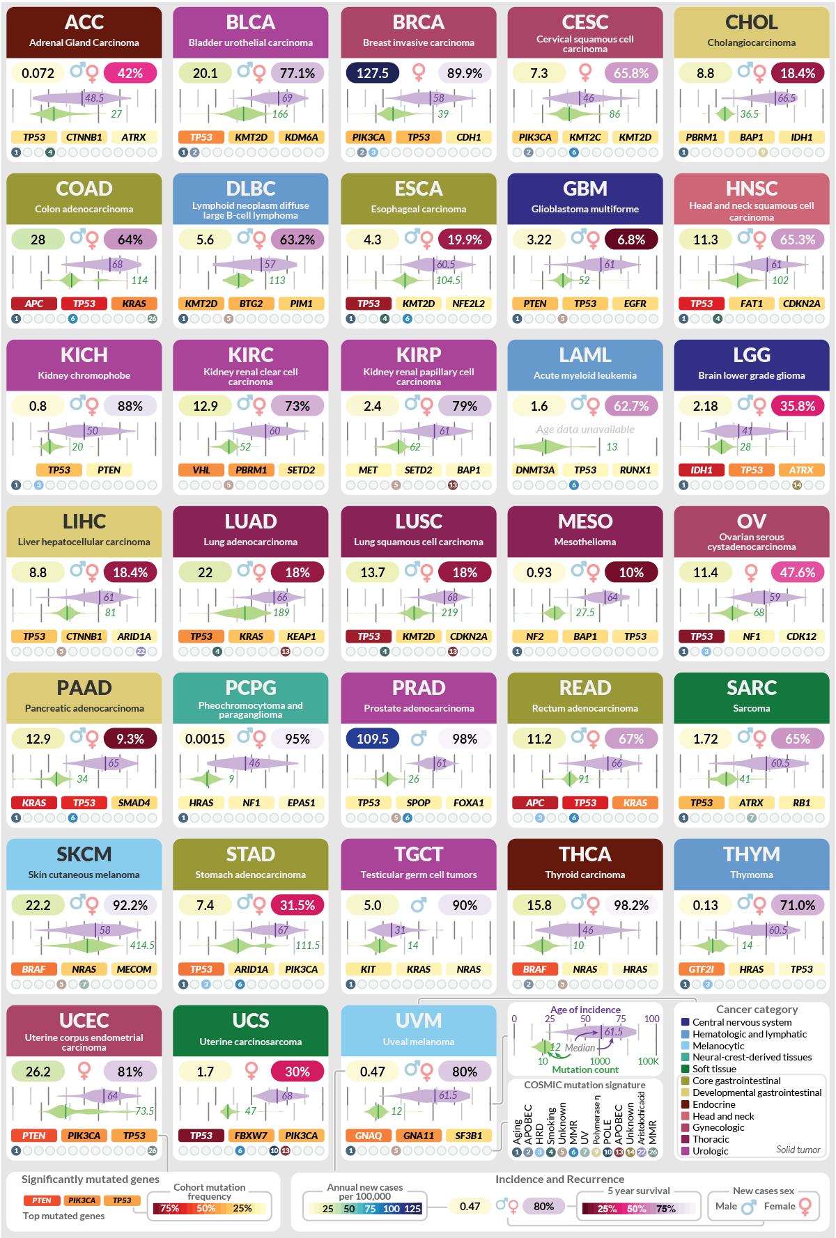
A visual summary of principal genomics findings across 33 cancer types
The Cancer Genome Atlas (TCGA) project spanned 15 years and collected 10,000+ cancer samples across 33 cancer types. This figure is a visual summary of its principal findings for a recent review article. Displaying large quantities of data to make it accessible and digestable can be challenging. My approach here is based on baseball cards: to visualize a multiple information sets by placing them in regular positions, encouraging visual exploration and comparison. Twelve different datasets are displayed for each cancer type, with quantitative information elements generated in R and final assembly and layout in Adobe Illustrator. The resulting figure successfully makes clear observations such as the prevelance of TP53 mutations, and the relative increase in mutation frequency in skin and lung cancers.
Published in Chen, F., Wendl, M.C., Wyczalkowski, M.A. et al. Moving pan-cancer studies from basic research toward the clinic. Nat Cancer 2, 879–890 (2021). https://doi.org/10.1038/s43018-021-00250-4
PDF of figure
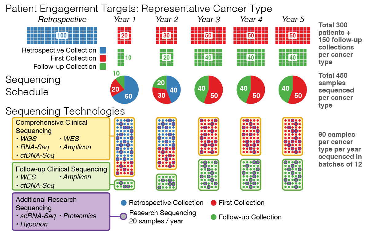
Multi-year tissue sample collection strategy for a grant proposal
This figure illustrates various aspects of multi-year cancer sample collection proposal, including the types of samples, sample counts per year collected and processed, and the breakdown of various types of analyses. It also helps clarify overlapping concepts such as patients, samples, and sequencing runs. The graphic was refined many times during the evolution of the grant proposal, and the discussions generated during this process themselves clarified thinking about the collection strategy. The grant proposal was well received and ultimately successful, illustrating the value of clear and compelling graphics in competitive applications.
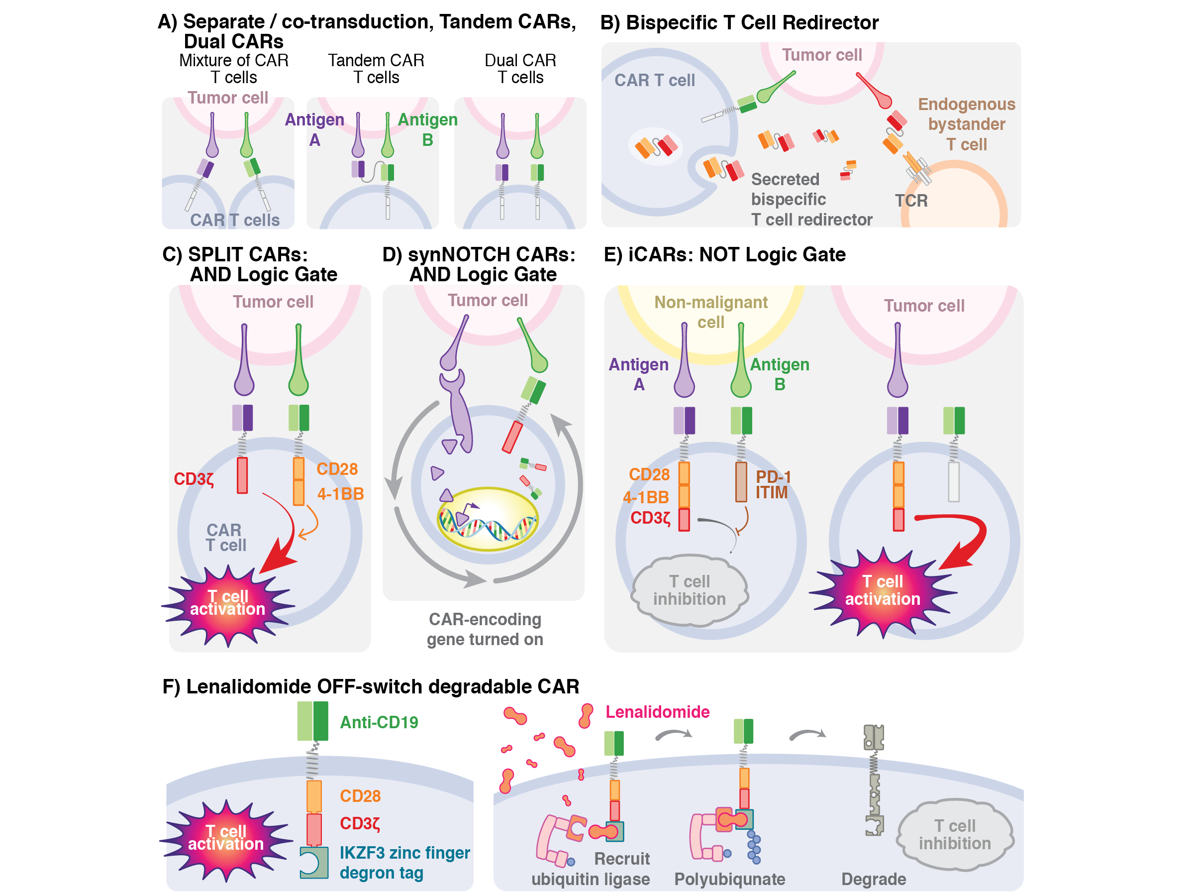
Immunological engineering strategies for cancer therapy
Immune cell control strategies for cancer therapy illustrated for the book Gene and Cellular Immunotherapy for Cancer. I provide a visual representation for a number of immunological engineering techniques to an audience of clinicians and researchers in the field. To communicate effectively with this audience, it was important to become familiar with the technical content as well as existing visual conventions - having a background in biomedical research is very helpful in doing so. The final figure illustrates the technical points in an accessible and visually appealing way, and complements other figures throughout the book.
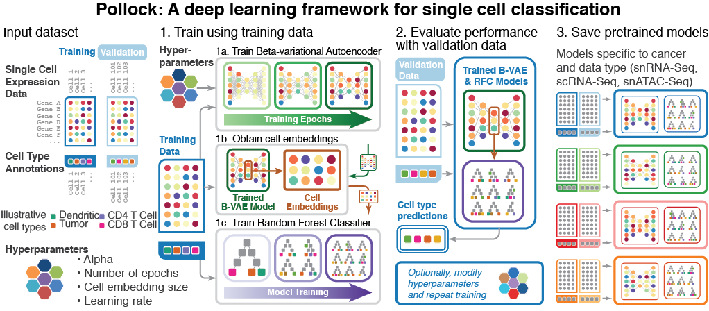
Details of a machine learning algorithm and training strategy
I worked with graduate student to illustrate the key aspects of a machine learning algorithm and training method they developed, named Pollock. The experience underscored the importance of finding the right level of explanation for a given audience: too much detail will lose the forest for the trees, while too little makes the figure glib and uninformative. Key points should be made immediately clear, while additional inspection be rewarded with interesting details and connections. Finally, an illustration should be visually appealing, with well chosen colors and a layout which guides the eye. Working with students and researchers to help them tell their story in an accessible way is one of the most enjoyable parts of what I do.
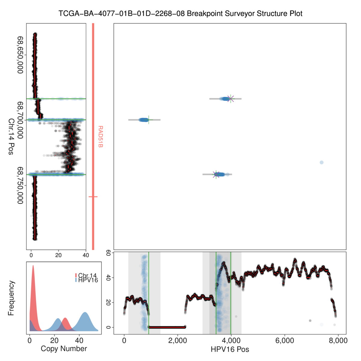
BreakpointSurveyor is an automated pipeline for visualizing genomic data
BreakpointSurveyor is a bioinformatics and data visualization pipeline I developed to visualize complex viral integration events in genomic data. Its innovative 2D visualization technique allows a number of lines of evidence of virus integration into the human chromosome in cancer to be portrayed clearly, and was used to screen large numbers of such events. This comprehensive computational pipeline includes bioinformatics preprocessing as well as visualization steps, was published and is available on GitHub.
M.A. Wyczalkowski, et al.; BreakPoint Surveyor: A Pipeline for Structural Variant Visualization. Bioinformatics 2017. doi: 10.1093/bioinformatics/btx362